Infographics are one of the fastest growing content methods currently making their way around the web. Although Matt Cutts may have recently discounted them as a low priority for search engine optimisation, they can provide some fantastic branding, good links, and positive attention.
If you’re looking to get onboard the Infographic bandwagon, you’ll need to start with a concept, and then a means of constructing it.
The concept will usually tell some sort of story, or have a specific point to make. Often the point will be validated with data examples. However, this doesn’t always need to be the case. More common infographics containing comparisons, processes such as flowcharts, or events (the history of…) are making themselves more prevalent.
Once you have an idea of what you want to say, you’ll need to visualise it. If you have an in-house designer, then your problems end here. You can give a brief and it will be constructed. However, the majority of those who want to produce an infographic have the data, but not the designer. Freelancers area great, but can often be expensive and will have other clients too.
Thanks to the popularity of infographics, there are now plenty of tools emerging online to help design them yourselves. Here are our top 10 resources which should help you construct all the emerging faces of infographics, and they’re free.
Piktochart

Piktochart offers a powerful editor to easily create infographics using a drag and drop process for shapes and texts. Select a template to work from and off you go.
Infogr.am

Although limited in its amount of templates currently available, this site is still in Beta form meaning the only way is up. For a basic infographic in very little time, this provides a good solution.
Diagram.ly
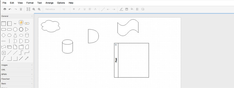
A useful took for producing free diagrams. However, you will need a solid idea of what you are after, as you start with a blank canvas, and no templates.
Hohli

If you want a chart, look no further. This online chart builder uses a form for you to fill in data. Select your colours and chart type and it is created for you.
Wordle

If your data isn’t numbers, but a collection of words, these ‘word clouds’ present text in a more colourful way, turning plain old words into an image worth sharing.
GunnMap
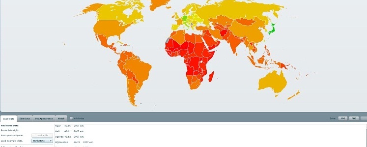
GunnMap provides a map of the world and you provide the data you would like to display. This is particularly useful for country comparisons. Different countries are displayed as different colours depending on your scales.
Juice Analytics
http://www.juiceanalytics.com/

This site exists to help with web analytics. Sometimes when you look at data every day it can become easy to miss details, but using a visual took to display this data can help see it in a new light.
Inkscape
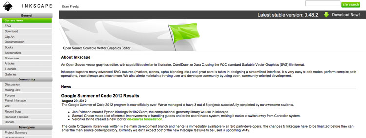
A graphics editor not too dissimilar to Adobe illustrator, Inkscape allows you to ‘draw’ images for use on your infographics, for free.
RSS Voyage
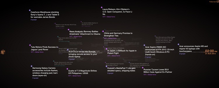
A different way to view your RSS feeds, Voyage pulls in RSS feeds from your favourite sites and presents them in a visualised timeline for a new reading experience.
Creately
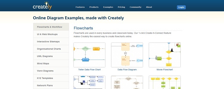
Great for flowcharts, organised charts and data visualisations which are purely about the data and less about design, Creately helps to generate all types of graphs, from Venn diagrams to family trees. This one actually isn’t free but starts from as little as $5 monthly.
What’s important to remember in the creation of infographic is the overall message. Why are you creating it in the first place? Visualisations of data are hugely helpful for analysis, and particularly eye-catching for illustrating conclusions, but unless they portray a message, they are a waste of time. Don’t let your great designs fall in this category.