Like any first impression, your landing page is kind of make or break. When it looks like a thirteen year old’s MySpace profile circa 2005, you’re probably not going to attract the numbers you’d like.
When, however, your landing page is fun and clean and it has compelling calls to action, you’re sure to fare a whole lot better. Here are our top 10 picks of high quality landing pages that get it just right.
10. Verisign

Why this site makes the list:
If you’re like me, you’ve certainly seen the Verisign seal at the bottom of your fair share of websites. It’s a well-designed logo and brand name, effectively communicating trust and reliance in a simple checkmark and name. But I for one really didn’t have any idea what Verisign did until I saw this landing page. With a bold, explanatory headline to frame the conversation and three clear columns, this page does a great job of balancing compelling graphics and cogent copy. It’s designed like an infographic, with segmentation of information and an easy to follow flow between each part. What’s more, each call to action (CTA) has clear benefits for a business. Altogether, this page makes a compelling case for trusting in their services and converting into a customer.
9. Strawberry Jam

Why this site makes the list:
There’s a lot that’s going right on this landing page. For one, it’s just fun to look at. Inside the bottle of jam are logos for the biggest social media sites, which helps provide context. The CTA (email sign up) is featured prominently in the center of the page and integrated nicely into the graphics, though they could probably have more compelling language there. There’s also some nice social proof up top with a Twitter quote. The only problem: we can’t really tell what the site is about unless we follow those arrows below the fold, where there is more explanatory information. Not a problem in itself, but it would be nice if those arrows were at little bigger to give us a better sense of where we’re meant to go.
8. Shall I Buy?

Why this site makes the list:
The concept behind Shall I Buy? is pretty simple, and here we get a good sense of what it’s all about. The CTA is centrally located, and the invitation to sign up for the beta site is more compelling than a simple, “sign up.” The picture of the phone helps us understand how this site would fit into our mobile lifestyle, and the hand humanizes the product. Overall, a great clean and compelling look for a product we can instantly understand.
7. Cheezburger Sites

Why this site makes the list:
It takes a lot to make such a long landing page work, but cheezburger knocks this one out of the park. At the top of the page we have mixed into a visually interesting graphic a clear CTA, one that is repeated in various manifestations throughout the page so that we really see the value. Content is well-chunked both vertically and horizontally so that we can process every angle of the story as it’s being told. What’s more, there’s a lot of variation in design within each section, so we never get bored. In this way Cheezburger has kept entirely on voice, recreating the site’s style and sensibility from the very first page.
6. YouSendIt
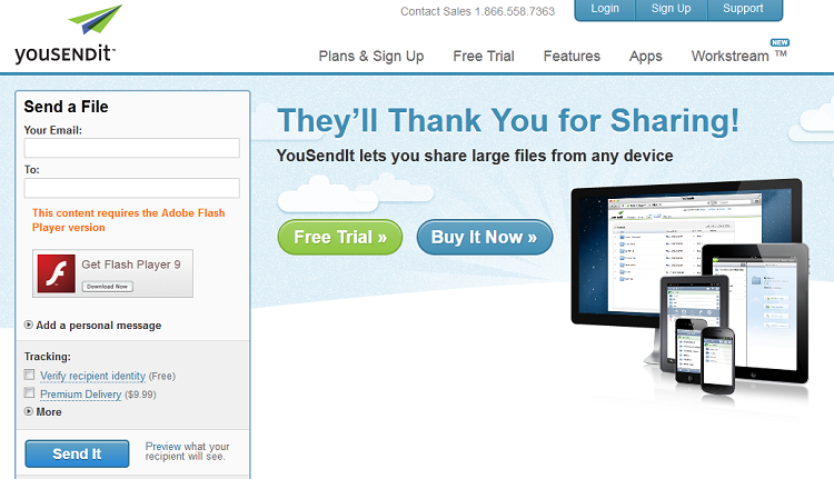
Why this site makes the list:
There’s actually a lot about this landing page I would change. I wouldn’t have those tabs up top, which can distract users before they sign up and I’d save the small agreement text for a pop up screen. That said, YouSendIt does a good job of emphasizing the clear value here (the 14 day free trial). It has a clean, fun look and compelling CTA text on the submit button, as well as expert approval from other trusted brands. And, most importantly of all, it has a tiny sign up page, which provides very few barriers to conversion.
5. Chute
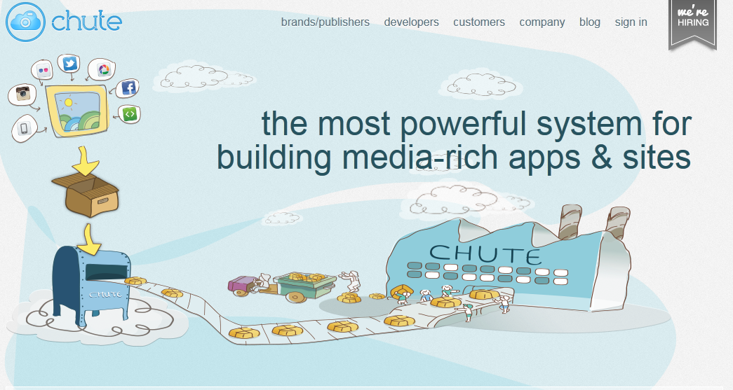
Why this site makes the list:
Like the Strawberry Jam page, the Chute landing page is quirky and fun — depicting the kind of carefree world it’d be fun for us to play in. What’s more, the full concept of the site is communicated clearly both by the camera with a cloud parachute and the text that reads, “Put your camera in the cloud.” The CTA text over the email submit box is also unique and compelling.
4. Ben the Bodyguard

Why this site makes the list:
We may not know a lot about Ben, but that’s the point. By building both their site and their landing page around this mysterious persona, we can’t help but be intrigued by this service. Plus, Ben doesn’t need a whole lot of copy or explanatory text to let us know he’ll get the job done. It’s a great look and a great strategy, complete, of course, with all the relevant social media buttons at the bottom to make us feel like we have a way of connecting with this enigma.
3. Living Social
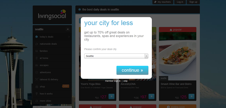
Why this site makes the list:
Living Social doesn’t dance around its desire for conversions. It presents a personally relevant, location-based sign up screen with an enticing deal right up front. And dimmed in the background — out of reach yet so tempting — is a beautiful picture of a city in which these deals can be used, and enticing photos of the kinds of things users can have. I challenge you not to hit that button and continue.
2. H. Bloom
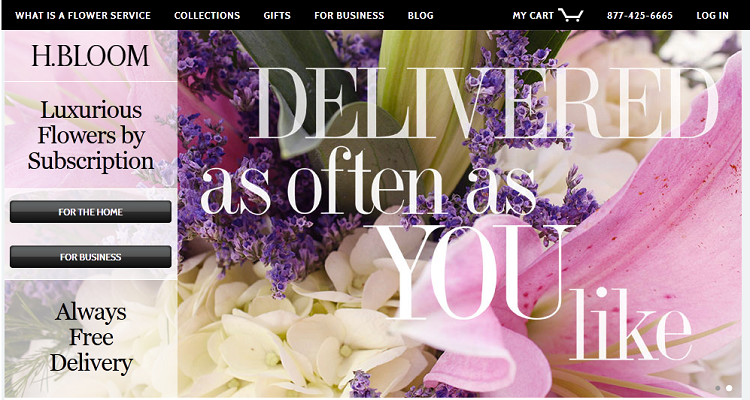
Why this site makes the list:
I just love the white background and clean look on this site, which work together to make both the product and the CTA buttons pop off the page. The designers did a great job of repeating the CTA throughout the page, breaking up content with clear section breaks. Extra points for the “Featured In” stamp of approval right beneath the fold.
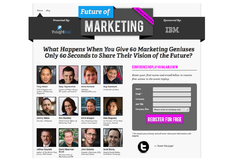
1. The Future of Marketing
Why this site makes the list:
This site has a clear, clean design, split into easy to consume subsections. It opens with a compelling question, and has all kinds of social proof going on. How can we do anything but “register for free” when we see the faces and titles of such lauded industry experts? The message is simple, actionable and compelling.
As you can see, there are many ways to make a great landing page. With these as your guide, you’re sure to make the kind of page that will have the conversions rolling in.
Rob Toledo is a designer, a Firefox fanboy, and no longer supports IE7. He is working alongside Shutterstock creating guides to the proper use of stock photography and stock videos in web design. He can be reached on Twitter @stentontoledo